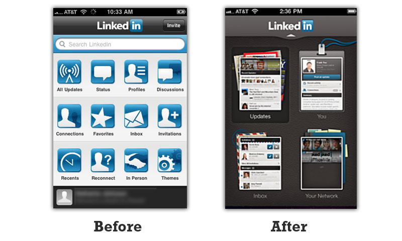
Just finished reading this post on UX Mag about Overhauling a UI Without Upsetting Users. It discusses in great detail how companies like Facebook and Twitter, and even Google, have riled user with large, wholescale design updates.
I’ve discussed the Google Designer Drain and reviewed Twitter’s redesign issues in two previous posts; see those for more background.
Design is important to us and because we don’t like change we complain about big changes, but changes, done incrementally, can work wonders for a website’s effectiveness and membership count. Has anyone noticed Pinterest’s design changes of late?
I think LinkedIn is a great example of a company that 1. Makes a tidy profit even though they are public Facebook can’t say the same at the moment, 2. Has updated their mobile app and website gradually without upsetting users and 3. Continues to keep people engaged without being silly or spammy or even very groundbreaking in their design.
Their latest “redesign” involved making their navigation black. It stayed in the same place and contains much the same content and links.
The smart move with users is to not shock them too much, but to keep iterating in small amounts and in ways that makes things easier and faster for them to achieve their goals.
